If you’ve ever stood in front of a display of preserved roses and hesitated—not because of the price, but because of the color—you’re not alone. And if you’re a brand buyer, a merchandiser, or someone in charge of building a product line, that decision matters more than most people think.
Choosing the right color for your forever rose box isn’t just about taste. It’s a branding move. And the wrong color? It could confuse your message, miss your audience—or worse, be ignored.
Let’s break down what works, why it works, and how you can use color to build stronger connections with your customers.
Why the Right Color Isn’t Optional
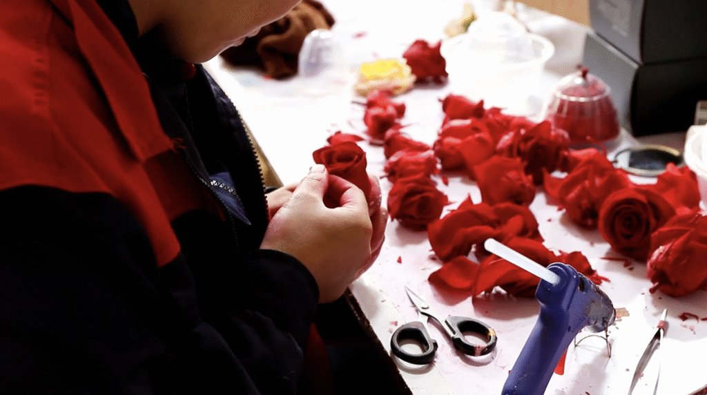
In the floral gift world, preserved roses have a kind of magic: they don’t wilt, they don’t fade, and they don’t scream “temporary.” They hold space—for sentiment, for memory, for identity.
But while the flower lasts, your customer’s attention doesn’t. That’s why first-glance impact is everything.
Here’s the truth: in our experience at Sweetie-Gifts, color can drive more than just emotional response—it can influence purchasing behavior, shelf visibility, and even customer retention. Yes, all that from color.
Think Like a Brand, Not Just a Buyer
The color you choose should align with your brand values, your audience’s expectations, and the moment of gifting. Ask yourself:
- Are you targeting luxury, minimalism, or playfulness?
- Is this for a romantic campaign, a corporate thank-you, or a seasonal shelf refresh?
- What colors does your brand already own?
For example, if you’re a wellness brand, rose gold and mint green might say “clean and gentle” far better than fire-red. Meanwhile, a men’s grooming line might go for navy and metallics over pink and lavender.
The color isn’t just about what looks good. It’s about what feels right.
Match the Emotion, Not Just the Occasion
Here’s how we often guide our clients:
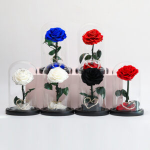
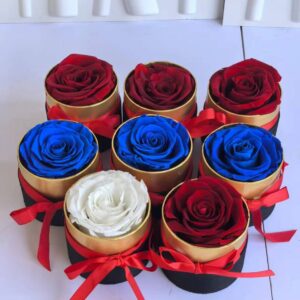
- Crimson & Black → Intensity, luxury, exclusivity (think high-end fragrances or Valentine’s bundles)
- Pastel Pink & White → Tenderness, grace, calm (great for Mother’s Day or wellness brands)
- Midnight Blue & Silver → Trust, professionalism, elegance (perfect for corporate gifting)
- Gold on Nude → Celebration, success, refinement (ideal for anniversaries or limited editions)
- Lavender & Pearl → Whimsy, artfulness, depth (best for museum collections or cultural collabs)
Every pairing evokes a feeling. And feelings sell far more than features ever do.


Two Real Projects That Got It Right
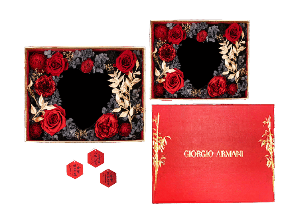
1. Luxury Meets Passion – Armani’s Custom Box
We worked with Armani on a preserved flower gift box that needed to reflect the richness of their “Eternal Love” theme. The final palette? Red roses, black interior, and gold foil leaves. Visually bold. Emotionally elevated. Exactly what the customer expects from a legacy fashion house.
The color contrast didn’t just look good—it translated into higher engagement and strong in-store presence during their Valentine’s Day promotion.
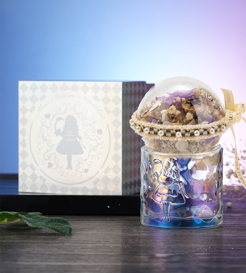
2. Storybook Charm – British Museum’s “Alice” Gift Set
For the British Museum, our task was to blend preserved roses into a fantasy-driven product based on Alice in Wonderland. The final look used lavender blooms, khaki greens, and muted yellow fillers—an unexpected palette that felt whimsical but grounded. The iridescent dome container amplified that effect, and the result was both collectible and emotionally charming.
Practical Tips for Color Selection
If you’re a buyer or product manager planning your next line, here’s what I’d recommend:
✅ Audit your brand – What colors do your logo, social media, and packaging lean toward? Use that as a base.
✅ Know your calendar – Are you prepping for a seasonal launch? Tie in cultural associations.
✅ Ask your audience – What resonates with them? Look at your past bestsellers.
✅ Stay consistent – If you go bold with rose color, let the box support it, not clash with it.
✅ Custom is worth it – Don’t settle for generic combos. You can request Pantone-matched flowers and boxes with MOQ as low as 100 pcs.
Final Takeaway
Color is more than decoration. It’s strategy. It communicates your brand when words can’t—and connects with your customers in a language they feel before they even read the tag.
So next time you’re building out your preserved rose offering, don’t treat color as an afterthought. Treat it as your silent storyteller.
Need help choosing the perfect combination?
📩 Reach out to us at inquiry@sweetie-group.com. We’re here to help you build color-driven gifts that sell—and stay.
Warmly,
Annie Zhang
CEO, Sweetie-Gifts