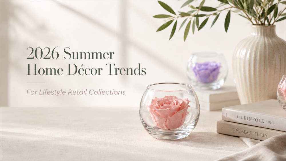
A summer home collection does not become stronger just because it follows more trends. In fact, the opposite often happens. Too many colors, too many materials, and too many themes can make a collection feel scattered.
The more useful question is simple:
Which home décor trends can be translated into products that look natural on a shelf, in a room, and inside a lifestyle retail collection?
Houzz’s 2026 U.S. Emerging Summer Trends Report gives a helpful starting point. The report is based on U.S. Houzz search growth from January to March 2026 compared with the same period in 2025, covering areas such as soft geometry, tactile textures, warm colors, wellness spaces, eco-conscious choices, small outdoor areas, and European garden romanticism.
This article does not treat those trends as direct product formulas. Instead, it looks at how they can influence color, material, scale, packaging, display, and small decorative objects for lifestyle retail collections.
Quick Takeaway: What These Trends Mean for Lifestyle Retail
| Home Décor Signal | Retail Collection Translation |
|---|---|
| Soft geometry | Rounder forms, domes, curved trays, softer box shapes |
| Tactile texture | Matte paper, fabric, ceramic, moss, wood, stone-like surfaces |
| Warm earthy colors | Rust, sage, taupe, cream, mushroom, olive, chocolate brown |
| Wellness styling | Calm shelves, natural accents, fragrance, bath and bedroom displays |
| Eco-conscious choices | Simpler packaging, less plastic, glass, paper, reusable structures |
| Compact spaces | Mini objects, shelf décor, small tabletop pieces, easy-placement items |
| European garden romance | Glass, moss, muted florals, soft greens, ceramic, vintage garden mood |
For floral décor, preserved botanicals, or small decorative object ideas based on these directions, Sweetie can be reached at inquiry@sweetie-group.com.
1. Soft Shapes Are Becoming Easier to Place
One of the strongest signals in the Houzz report is the movement toward curves and soft geometry. Searches for “scalloped tile” increased more than three times, while “arched range hood” rose 177%, “arched pantry door” rose 130%, and “rounded kitchen island” rose 123%.
For lifestyle retail, the point is not to copy arches from architecture. The point is that softer shapes are easier to live with.
A product with a curved edge often feels less strict than a sharp rectangular block. A glass dome feels more gentle than a flat acrylic box. A rounded tray, scalloped paper edge, circular frame, or soft-edged package can make a display feel more relaxed.
This is especially relevant for smaller decorative objects because they often sit close to other home categories: candles, ceramics, books, fragrance, photo frames, and textiles. Hard lines can look clean, but too many hard lines make a shelf feel cold. Soft geometry adds movement without needing strong decoration.
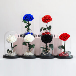
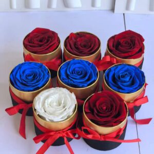
For floral décor, this is why domes, round boxes, curved windows, and softly shaped tabletop pieces often feel more at home in lifestyle settings than overly rigid gift packaging.
2. Texture Is Becoming Part of the Product Story
Houzz notes strong search growth for tactile materials, including “sandstone” up 257%, “linen wallpaper” up 104%, “seagrass wallpaper” up 94%, “Venetian plaster” up 94%, “terracotta flooring” up 55%, and “limewash interior paint” up 53%.
These are interior terms, but the retail lesson is broader: flat and glossy are no longer the only ways to look polished.
Texture can come from many details:
- A paper box with a soft matte finish
- A ceramic base with a handmade look
- A fabric ribbon instead of a shiny plastic bow
- A moss or botanical surface inside a glass object
- A wood base paired with glass
- A stone-colored display riser
- A flocked or velvet-touch decorative detail
Texture helps a small item feel more finished. It gives the eye something to rest on. It also helps different objects work together on a shelf.
For lifestyle retail, this matters because many products are not sold alone. They are shown as part of a mood: bath and body, fragrance, bedroom, entryway, seasonal table, or giftable home décor. Texture makes that mood easier to build.
3. Earthy Colors Are Moving Beyond Paint and Walls
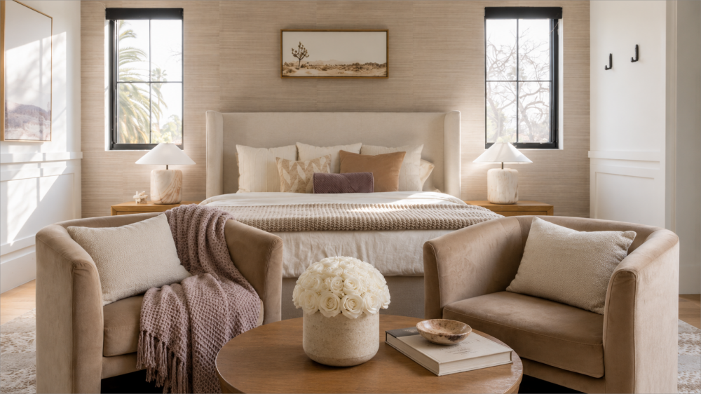
The Houzz report shows clear growth in warm, earthy color searches: “rust colors” up 178%, “chocolate brown” up 153%, “mushroom color” up 69%, “olive green” up 57%, “sage” up 55%, “taupe” up 50%, and “cream” up 44%.
For retail collections, these colors are useful because they are flexible. They do not feel locked to one holiday.
Bright red may work well for Valentine’s Day. Vivid pink can work well for Mother’s Day. But cream, sage, taupe, rust, mushroom, olive, and warm brown can stay longer in a home décor environment.
They also combine well with other lifestyle categories:
| Earthy Color | Works Well With |
|---|---|
| Cream | Glass, soft packaging, neutral flowers, candles |
| Sage | Moss, bath products, wellness shelves, botanical displays |
| Taupe | Premium boxes, ceramics, textiles, paper wrapping |
| Rust | Autumn accents, warm florals, wood, amber glass |
| Mushroom | Minimal décor, stone-like textures, muted botanicals |
| Olive | Garden themes, natural fragrance, small decorative objects |
| Chocolate brown | Winter warmth, wood bases, luxury packaging |
This color direction is useful for preserved flower décor because it moves floral products away from a purely occasion-based look. A cream rose under glass, a sage moss base, or a taupe package can feel more like home décor than a traditional holiday gift.
For color palette suggestions or sample direction, contact inquiry@sweetie-group.com.
4. Wellness Styling Is Becoming a Shelf Language
Houzz reports strong growth in wellness-related home searches, including “wellness room” up 164%, “calming” up 139%, “biophilic design” up 112%, “spa” up 68%, “sensory room” up 43%, and “yoga room” up 20%.
In retail, wellness does not always need to become a large product category. Often, it becomes a shelf language.
That language is easy to recognize:
- Soft neutral colors
- Pale wood
- Light green accents
- Natural fragrance
- Clean packaging
- Calm product spacing
- Smooth ceramic or glass
- Botanical details used with restraint
The best wellness-style displays do not feel crowded. They feel clear.
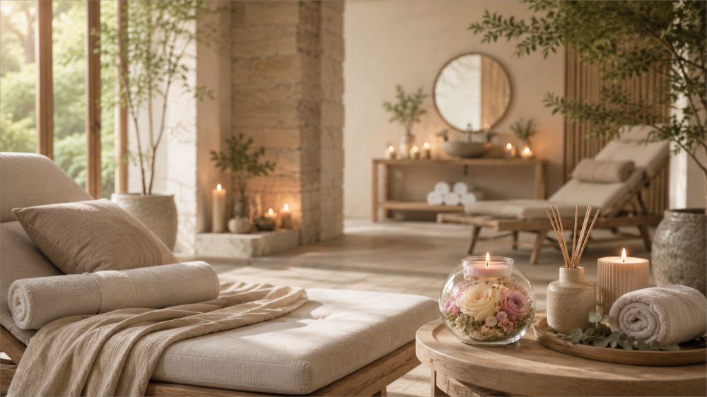
This is where botanical décor can play a quiet role. A small preserved flower dome, moss detail, or neutral floral object can soften a bath display, fragrance table, bedroom shelf, or home office corner. The floral element should not overpower the setting. It should help the display feel calmer and more complete.
The design rule is simple: fewer colors, better materials, and more breathing room.
5. Sustainability Is Showing Up in What Customers Can See
The Houzz report also highlights eco-friendly choices. Searches for “repurposed materials” nearly tripled, “recycled glass countertop” rose 84%, “native landscape” rose 59%, “sustainable” rose 42%, and “bamboo flooring” rose 32%.
For lifestyle retail, sustainability should be handled carefully. A natural-looking product is not automatically sustainable, and broad claims can sound weak if they are not supported.
A better approach is to focus on visible, specific choices:
- Less plastic
- Paper-based packaging
- Reusable boxes or glass covers
- Wood or bamboo details
- Clear care instructions
- Durable display structures
- Fewer unnecessary packaging layers
This applies especially to floral décor. Preserved flowers are not disposable in the same way as fresh flowers, but they still need careful explanation. The value is not in making vague environmental claims. The value is in showing how the product is made, how it should be cared for, and how it can last longer in a home setting.
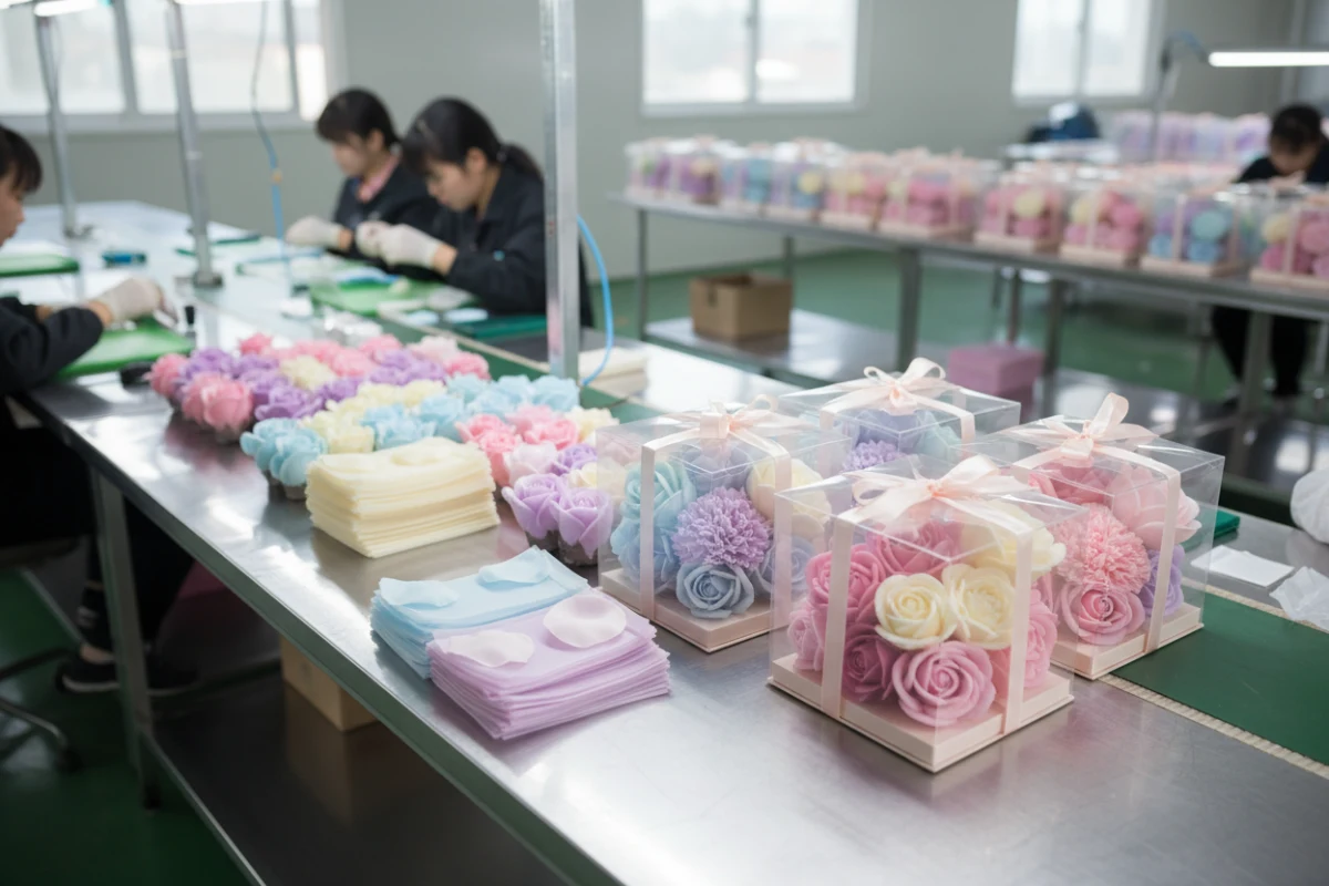
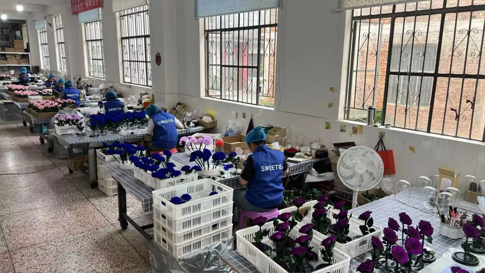
Sweetie’s preserved flower process includes selecting fresh flowers, dehydration and degreasing, shaping, coloring, and natural drying, with the full process taking around one to two months depending on the environment. That production background can help explain why preserved floral décor should be treated as a long-lasting decorative object, not a short-use item.
6. Compact Décor Has More Room to Grow
Houzz also points to rising interest in compact outdoor spaces. Searches for “small front yards” rose 79%, “small courtyards” rose 63%, “small patio garden” rose 57%, and “small backyard” rose 43%.
For retail collections, the useful lesson is scale.
Not every home has space for large décor. But many homes have a shelf, desk, bedside table, bathroom counter, windowsill, entryway surface, or small balcony.
This gives compact decorative objects a clearer role.
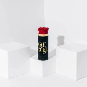
Small décor should not feel like a reduced version of a bigger item. It should feel complete at its own size. A mini glass piece, small botanical object, framed flower, compact flower box, or single-stem display can work well when the scale feels intentional.
Compact objects are also easier to use in retail displays. They can sit near candles, fragrance, stationery, jewelry, seasonal gifts, or checkout areas. They are small, but they can carry a strong visual message.
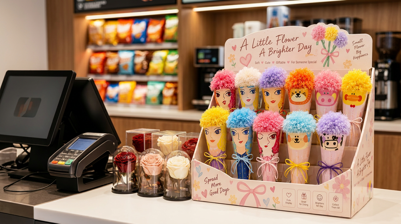
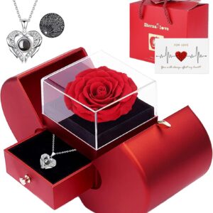
Sweetie has developed “small but beautiful” floral products for offline retail scenarios, including checkout-adjacent displays, refrigerator magnet bouquets, car bouquet displays, and small acrylic rose display boxes. This type of product thinking fits naturally with the compact décor direction.
7. European Garden Romance Is Becoming More Refined
European garden themes are another strong part of the Houzz report. Searches for “French courtyards” rose nearly six times, “Italian courtyards” rose 4.5 times, “cottage patios” rose 204%, and “English cottage patios” rose 131%.
This trend can easily become too sweet if it is translated too literally. More flowers alone do not create a refined garden mood.
A stronger version includes:
- Soft greens
- Cream tones
- Glass
- Moss
- Ceramic
- Stone colors
- Aged textures
- Muted flowers
- Objects that feel collected over time
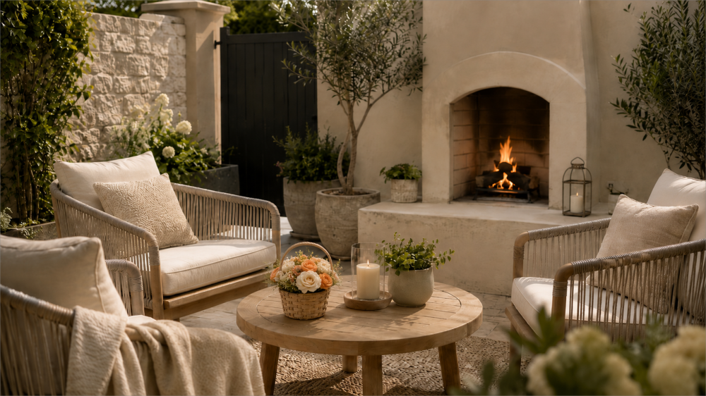
For lifestyle retail, this direction can work in spring and summer displays, tea table settings, garden-room stories, cottage-inspired accessories, and botanical home collections.
Floral décor fits here because it already has a natural visual language. But restraint matters. A preserved flower object with moss, glass, and muted colors can feel elegant. Too much bright color, glitter, or over-decoration can quickly move it back into a seasonal gift look.
Sweetie’s British Museum glass dome collaboration is a useful example of how preserved flowers, moss, hydrangea, figurines, and glass can be combined into a story-based decorative object rather than a simple flower gift.
How Floral Décor Can Support Lifestyle Collections
Floral décor fits these trends because it can translate large interior ideas into smaller, easier-to-place objects.
A full room may use arches, stone, warm paint, spa materials, or garden landscaping. A lifestyle collection can echo the same language through softer shapes, natural textures, muted colors, glass, moss, paper, fabric, and compact decorative forms.
Its strength is flexibility.
Floral décor can add warmth without changing the whole setting. It can bring a seasonal feeling without becoming tied to one holiday. A glass-covered botanical piece can suggest soft geometry. Moss or preserved hydrangea can add tactile texture. Cream, sage, taupe, rust, or mushroom tones can make floral accents feel closer to home décor than traditional occasion gifts.
For Sweetie-Gifts, this is where trend translation becomes useful. The goal is not simply to add flowers to a product, but to decide what role the piece should play in a collection: a quiet accent, a natural texture, a compact tabletop object, or a garden-inspired detail that feels easy to place in the home.
Sweetie-Group is built around the idea of “Flower + Everything,” with work across floral product design, development, production, and B2B service for international markets. The company has experience with preserved flower products, small decorations, plush flowers, glass domes, flower boxes, and customized floral display concepts for retail and brand projects.
For lifestyle retail collection development, email inquiry@sweetie-group.com.
A Practical Framework for 2026 Lifestyle Collections
Instead of building a collection around one trend, it may be more useful to combine several quiet signals.
| Collection Goal | Useful Trend Signals | Possible Product Language |
|---|---|---|
| Calm home accents | Wellness, earthy colors, tactile texture | Neutral flowers, moss, glass, matte packaging |
| Small-space décor | Compact spaces, soft geometry | Mini domes, small flower objects, shelf pieces |
| Summer garden display | European garden romance, soft greens | Glass, moss, muted florals, ceramic tones |
| Premium seasonal gifting | Earthy colors, texture, simpler packaging | Fabric, paper, warm color palettes, preserved flowers |
| Fragrance or bath display | Wellness, sustainability, compact décor | Botanical accents, glass covers, soft natural materials |
The best collections do not need to shout. They need a clear visual language.
That language may come from color. It may come from texture. It may come from shape, scale, or packaging. When floral décor is designed around these elements, it becomes easier to place inside a lifestyle retail environment.
Final Thoughts
The 2026 summer home décor trends from Houzz are not a direct instruction manual for retail products. They are better used as design signals.
Soft shapes, earthy colors, tactile textures, wellness styling, compact objects, simpler packaging, and garden-inspired details all point in the same direction: home décor is becoming warmer, calmer, more natural, and easier to live with.
For lifestyle retail, the opportunity is not to copy interiors. It is to translate the mood into smaller products that feel right on a shelf, a table, a counter, or a seasonal display.
That is where floral décor still has room to grow. Not only as a gift, but as a softer part of the home.
Annie Zhang, CEO of Sweetie Group