Color of the Year announcements are often treated as inspiration pieces, but for businesses planning products, gifts, and retail assortments, they function as early signals. By the time consumers see finished products on shelves, these color decisions have already shaped materials, packaging, and visual language across industries.
For 2026, a wide range of global brands have already released their official Color of the Year selections. When viewed individually, each color tells a brand specific story. When viewed together, they reveal how the market is recalibrating after several years of visual noise and rapid trend cycles.
This article brings together all officially announced 2026 Colors of the Year and explains what these choices suggest for companies developing physical products and gift collections. If you are planning ahead and need help translating these color directions into real, sellable items, you can contact us at inquiry@sweetie-group.com.
Why 2026 Color of the Year Announcements Matter for Business Planning
For B2B decision makers, color choices are not about personal taste. They affect inventory risk, shelf performance, and how long a product remains visually relevant.
In 2026, Color of the Year selections are coming from different types of organizations, including global color authorities, paint manufacturers, design brands, and retail platforms. Each group approaches color from a different angle, but together they form a reliable picture of where consumer expectations are moving.
The goal is not to follow every color. The goal is to understand which directions are becoming stable enough to support long term product decisions.
Pantone 2026 Color of the Year
Pantone selected Cloud Dancer, a soft white with warmth and airiness. Rather than acting as a statement color, it functions as a foundation. Pantone describes it as calm, open, and mentally grounding.
For product brands, this points to a shift away from sharp whites toward tones that feel more human and adaptable. Cloud Dancer works well for premium packaging, neutral gift bases, and products meant to feel timeless rather than seasonal.

Paint Brand Color of the Year Selections for 2026
Paint companies tend to choose colors that must perform well over long periods of time. Their 2026 selections strongly emphasize reliability and emotional comfort.
1. Benjamin Moore introduced Silhouette, a deep brown with subtle gray undertones. This color reflects confidence and refinement and supports the growing acceptance of darker neutrals in everyday products.
2. Sherwin Williams chose Universal Khaki, a balanced neutral designed for longevity. It signals a return to dependable colors that do not require explanation or justification.
3. Behr named Hidden Gem, a smoky blue green that balances calm with personality. This color is particularly useful for products that aim to communicate emotional value without visual intensity.
4. Valspar selected Warm Eucalyptus, a natural green that reinforces themes of wellness and restoration. It aligns well with products connected to nature, sustainability, and everyday gifting.
5. PPG announced Secret Safari as its 2026 Color of the Year within its global trend system. This yellow green tone introduces optimism and energy and works best as an accent or limited feature rather than a core color.
6. PPG Paints and Glidden both identified Warm Mahogany as their 2026 Color of the Year within different retail contexts. This shared direction highlights a broader return to rich, heritage inspired browns that feel stable and familiar.
7. Dutch Boy Paints selected Melodious Ivory, a soft off white that supports emotional comfort and simplicity. It is well suited for products connected to milestones such as weddings or commemorative gifts.
8. C2 Paint chose Epernay, a mineral inspired neutral that emphasizes craftsmanship and material honesty. This color performs best in smaller runs or premium collections where detail matters.
If you are evaluating which of these paint brand signals aligns with your product positioning, our team regularly helps clients narrow down practical options. You can reach us at inquiry@sweetie-group.com for guidance.

European Design Brand and Color Family Direction
9. Dulux took a different approach by introducing The Rhythm of Blues, a full blue color family rather than a single shade. This reflects the continued importance of blue as a safe and flexible option across markets.
For brands, this approach encourages consistency without rigidity. A color family allows variations across price points and product formats while maintaining visual cohesion.
10. Graham and Brown selected Divine Damson, a deep plum tone designed to add drama and confidence. This choice supports the idea that bold colors are returning in controlled and intentional ways rather than as mass defaults.
Retail and Platform Driven Color Signals for 2026
Retail platforms provide valuable insight into consumer behavior because their color choices are tied closely to demand.
11. Etsy named Patina Blue as its 2026 Color of the Year. Inspired by aged metals, this color reflects interest in authenticity, texture, and story driven design. It is particularly relevant for online channels and handmade style products.
12. IKEA selected Rebel Pink, a playful and expressive color that encourages creativity. While not suitable for every product category, it works well for limited editions, youth focused collections, and accent details.
What These 2026 Color Choices Reveal as a Group
When analyzed together, the 2026 Colors of the Year point to several clear patterns. Emotional calm is prioritized over visual shock. Natural tones continue to replace synthetic brights. Neutrals are becoming warmer and more expressive. Bold colors are used with intention rather than saturation.
For businesses, this means that restraint and clarity are becoming competitive advantages.
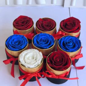
If you are planning 2026 assortments and want help applying these color signals to preserved flower products or gift packaging, feel free to contact us at inquiry@sweetie-group.com.

Applying 2026 Color Trends to Products and Gifts
For most brands, the best approach is selective adoption. One or two colors aligned with brand identity are usually enough. Packaging is often the safest place to introduce trend colors since it allows flexibility without locking products into short cycles.
Seasonal gifting benefits from softer blues, greens, and warm neutrals, while deeper tones such as mahogany or plum are better suited for autumn and winter collections.
How Sweetie Group Works with Color Trends
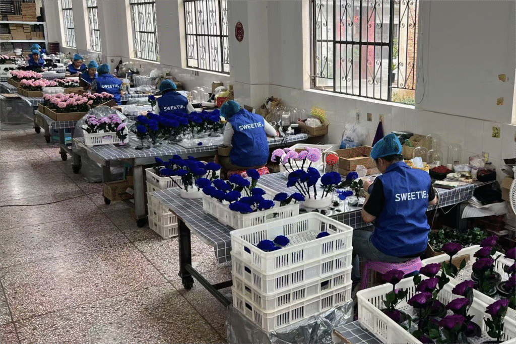
At Sweetie Group, we monitor Color of the Year announcements to support our clients with informed decision making. Our focus is on translating trend information into practical product solutions, whether for preserved flower gifts, custom boxes, or branded collections.
We support both small trial orders and large scale programs, helping partners reduce risk while staying visually relevant.
Closing Thoughts
Color of the Year announcements are not rules. They are reference points. When used thoughtfully, they help businesses make clearer, more confident decisions about products and presentation.
If you are preparing for 2026 and want support turning color trends into real gift products, you are welcome to contact us at inquiry@sweetie-group.com.
Annie Zhang
CEO of Sweetie-Group