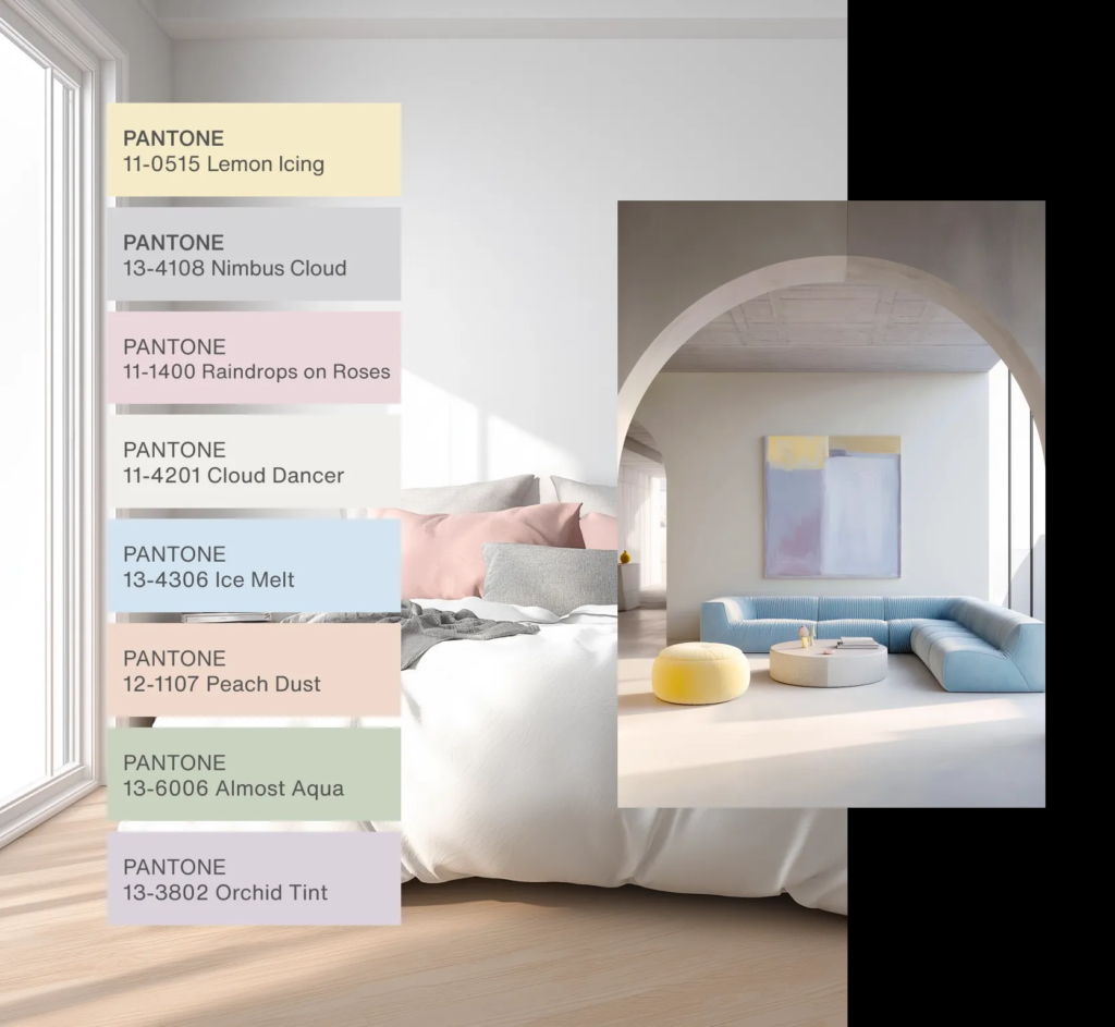
Each year, Pantone’s Color of the Year becomes a creative benchmark across industries. For 2026, the chosen tone, Cloud Dancer, is a soft, creamy white that evokes purity, calm, and quiet strength. While many brands will reference it in marketing materials, few will successfully turn this subtle shade into a meaningful business advantage.
This guide explains how professionals in the gift industry, particularly product developers and sourcing managers, can transform Cloud Dancer from a trend headline into a long-term design strategy that improves product value and brand perception.
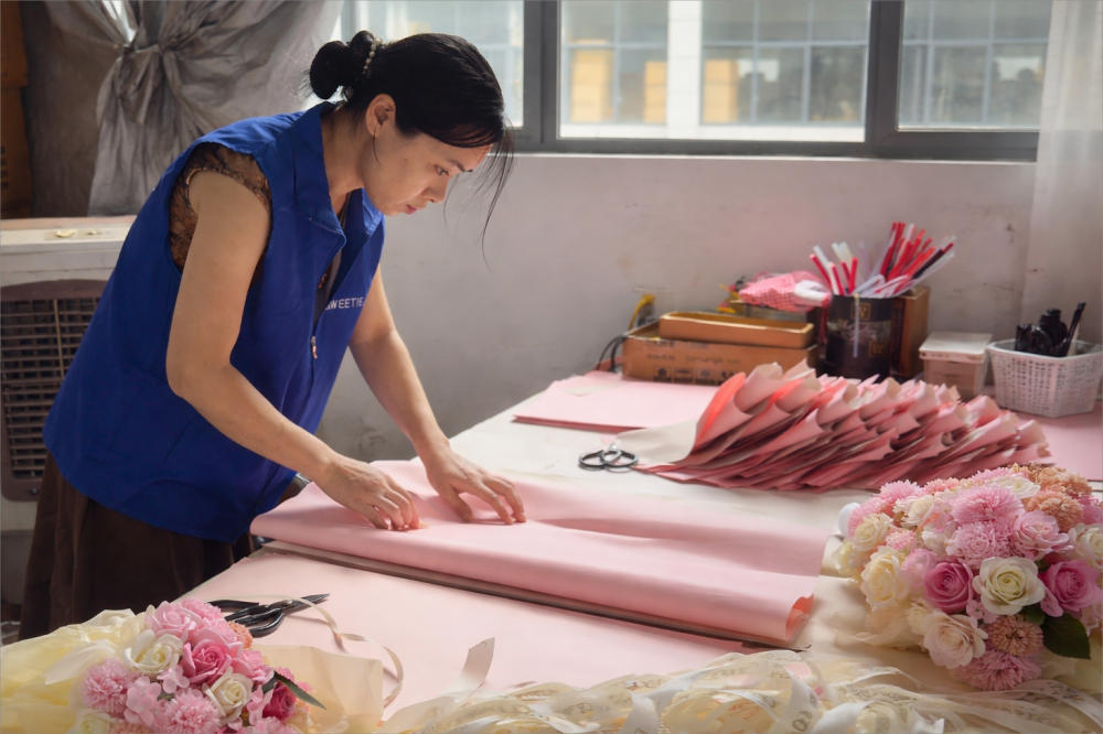
If you are planning your 2026 product roadmap and need guidance on how to integrate this trend effectively, contact us at inquiry@sweetie-group.com for an insight session.
1. Understanding the Emotion Behind Cloud Dancer
Cloud Dancer is more than a neutral color; it represents an emotional shift in consumer behavior. After several years of bold, expressive hues dominating the market, buyers are returning to simplicity, calmness, and tactile quality.
Consumers today want products that feel peaceful and well-balanced. In the gift category, this translates into designs that communicate authenticity, comfort, and presence. The color’s off-white softness allows space for reflection. It reminds people of calm mornings, clean air, and slow living — a mood that aligns perfectly with current lifestyle trends in Europe and North America.
For manufacturers, this insight is essential. When design teams understand the emotional logic behind the color, they can make smarter material, packaging, and texture choices that connect with real-world psychology rather than aesthetic hype.
2. Applying Color Psychology in Product Development
The key to using Pantone’s annual color successfully lies in context, not imitation. Instead of matching a hex code, think about what Cloud Dancer symbolizes and how that can shape your next collection.
1. Translate emotion into form.
Use Cloud Dancer as inspiration for design balance. Combine it with organic shapes, tactile materials, and soft lighting to create products that express calmness without appearing sterile.
2. Build texture-rich minimalism.
Pair this shade with linen finishes, matte ceramics, or natural fiber ribbons. The interplay between neutral tones and texture adds quiet sophistication.
3. Design for continuity.
Avoid treating Cloud Dancer as a seasonal accent. Use it as the foundation for a long-term palette that unifies multiple product categories and packaging formats.
4. Align it with your brand’s purpose.
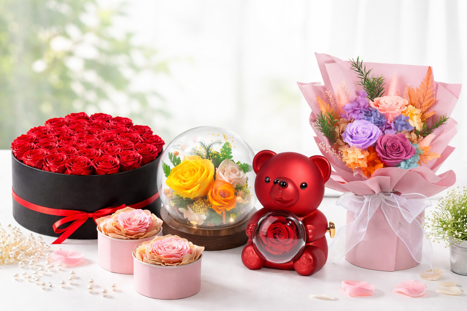
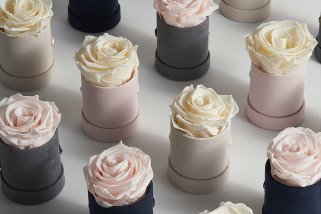
Every brand has its own emotional DNA. Cloud Dancer can help translate that identity into something visual and tangible. A sustainable gift line might use it to highlight purity, while a luxury line might pair it with warm metallics for timeless elegance.
If you want professional color-matching advice for 2026 material production or packaging consistency, our design consultants can assist you. Reach out anytime at inquiry@sweetie-group.com.
3. Practical Ways Sourcing Managers Can Leverage the Trend
Sourcing managers often struggle to balance aesthetic direction with operational practicality. Cloud Dancer offers an ideal bridge between trend and efficiency.
- Optimize for multiple holidays.
Because it is season-neutral, Cloud Dancer packaging can be reused across Valentine’s Day, Mother’s Day, or Christmas. By simply adjusting ribbon tones or inserts, you can repurpose existing stock while maintaining freshness. - Standardize supplier communication.
When briefing suppliers, describe visual intent rather than only specifying Pantone numbers. Phrases like “soft matte white with warm undertones” or “velvety eggshell finish” lead to more accurate results across materials. - Reduce visual risk.
Compared with bright colors that quickly age, Cloud Dancer retains timeless appeal. It helps build a stable, unified look for collections and decreases the risk of unsold inventory due to color fatigue. - Support sustainable packaging goals.
White-based designs often integrate easily with eco-friendly papers and natural fibers, supporting retailers’ growing preference for environmentally conscious presentations.
4. Why Calm Design Outperforms Flashy Aesthetics
In a digital world filled with noise, consumers are drawn to products that feel emotionally stable. They equate visual calm with reliability and quality. For brand owners, this is a signal that design restraint now communicates more value than excess decoration.
Gift products designed with Cloud Dancer as a base can enhance perceived craftsmanship. They photograph beautifully for e-commerce, create visual breathing space in retail displays, and help anchor brand consistency across physical and digital platforms.
By creating collections that embody calm confidence, you appeal to the growing global audience seeking balance over spectacle.
5. Building a Long-Term Visual Strategy
Trend colors often fade quickly, but the ideas they introduce can influence design direction for years. To make Pantone 2026 commercially relevant, use it as a strategic building block in your visual system.
| Strategic Focus | How to Apply Cloud Dancer Effectively |
|---|---|
| Brand Continuity | Use it across packaging, photography, and print to maintain a consistent tone of calm luxury. |
| Material Coordination | Match across paper, resin, and fabric to create visual alignment between product and packaging. |
| Customer Experience | Incorporate soft white in retail fixtures or gift bag designs to create an inviting, peaceful ambiance. |
| Longevity | Maintain Cloud Dancer as a neutral anchor while rotating accent colors by season. |
This approach turns color into an operational tool rather than a seasonal experiment. It allows both creative and supply teams to work within the same visual logic, increasing design efficiency and reducing waste.
6. Key Takeaway: Design with Intention, Not Imitation
Pantone’s Cloud Dancer represents more than a fashion statement. It is a call for thoughtful, emotionally intelligent design. For product developers, it offers a framework for clarity and calm. For sourcing professionals, it simplifies decision-making and reduces production risk.
When teams use color intentionally, they design not just for visual impact but for emotional connection. This is where true commercial success begins.
If you are exploring new packaging directions or product aesthetics for 2026 and would like to align your ideas with market trends, connect with our experts at inquiry@sweetie-group.com. We are happy to share tailored insights based on real buyer behavior and retail data.
— Annie Zhang, CEO of Sweetie-Group